
 Mark E. Jeftovic is The Bombthrower
 This post was originally my comment to a person on Facebook, which somebody then deleted. This person repeatedly throws out the 1.2 M deaths worldwide number and I finally lost it and posted a response to him after he scolded people for “spreading disinformation and not listening to science”. He actually told people disputing the Second Wave Hysteria to “shut up and listen to the government and science”.
As one of my all-time favourite economists, Thomas Sowell, would say…. “Oh dear, where to begin?”
1 million or 1.2 million deaths worldwide sounds like a big number and on its own you can use it to club “Covidiots” into silence, that is, until you actually look at it.
For starters, bandying out a number, any number in isolation is meaningless. For any number to have any relevance, to anything, it has to be part of a data set or otherwise part of some meaningful comparison.
If we take the 1.2 million COVID deaths worldwide, at it’s face (more on that below), the obvious question then becomes “is that good or bad?”
The most useful signal we can get from a global COVID death toll is how it compares to what is called the “Absolute Fatality Rates” globally, which is simply the rate of all fatalities from all causes.
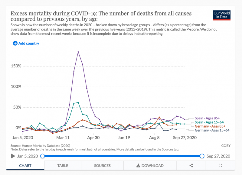
From the charts, we can clearly see, there was a lot of excess mortality in March and April, and then, like every other meaningful metric around Coronavirus, it drops off drastically and starts to level out, with a slight seasonal rise as we head into the winter.
Interestingly, in “no lockdown” Sweden, it turns out their absolute death toll is much lower than one would think:
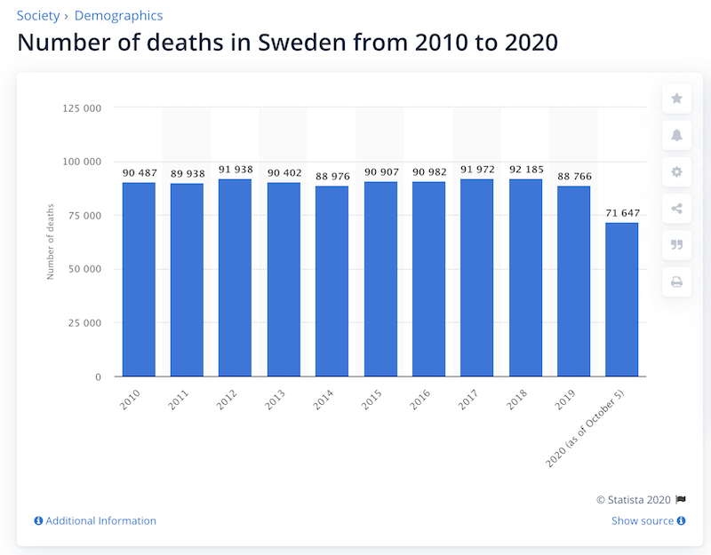
It could possibly come in lower by the end of the year, but if not, will come in not that much higher. Not as high as, say, the US or England.
If reducing fatalities is the goal, there is a much easier way to do that
Sadly, a lot of people die every day, and I’m sure you’ve seen memes on social media on how many more people die from other causes like Tuberculosis (1.4M in 2019) than COVID-19.
In the US, where the COVID death toll currently sits at 225K, it is estimated that medical malpractice kills 250K Americans a year.
But an even bigger number, according to the WHO, is that alcohol abuse kills 3 million people annually, and that number will surely go even higher this year given the massive spike in mental illness, domestic violence, child abuse, depression and suicide caused by the lockdowns.
If this is about saving lives, we could literally bring those alcohol related deaths to zero, turning it off like the flick of a switch by instituting a global ban on alcohol. We could do it tomorrow. Should we? The lives we save may include your own.
In fact if we banned alcohol then we could let Coronavirus run and still be ahead nearly 2M preventable deaths annually, provided COVID-19 kept going with the same intensity it was going in March and April, which it clearly isn’t (see below).
Of course, nobody would seriously entertain that, and they could probably articulate some decent logic around why we shouldn’t.
But they may dismiss it without considering how closely the lockdown approach toward reducing COVID fatalities is analogous to a worldwide ban on alcohol to eliminate alcohol related deaths would be. Especially since we also know that a large portion of coronavirus fatalities die with COVID-19 and numerous other comorbidities* than of it (however, see my footnote on that at the end of this post).
In that sense, alcohol related carnage is very similar. Few alcoholics drink themselves to death outright. Far more kill themselves (and others) in car accidents, commit suicide, or generally wreck their livers, hearts, kidneys, brains or generally run themselves down so low nearly anything else will finish them off.
Second Wave Hysteria
Case counts are clearly rising again globally, that much is true and we have oodles of data to track it. With it, there come fears of the dreaded “Second Wave” of fatalities.
In the often cited Spanish Flu of 1918, the bulk of the fatalities came in the second wave. However, the Spanish Flu was a very different pandemic than the one we have today. That one attacked people right in the early years of the prime-of-life age curve:
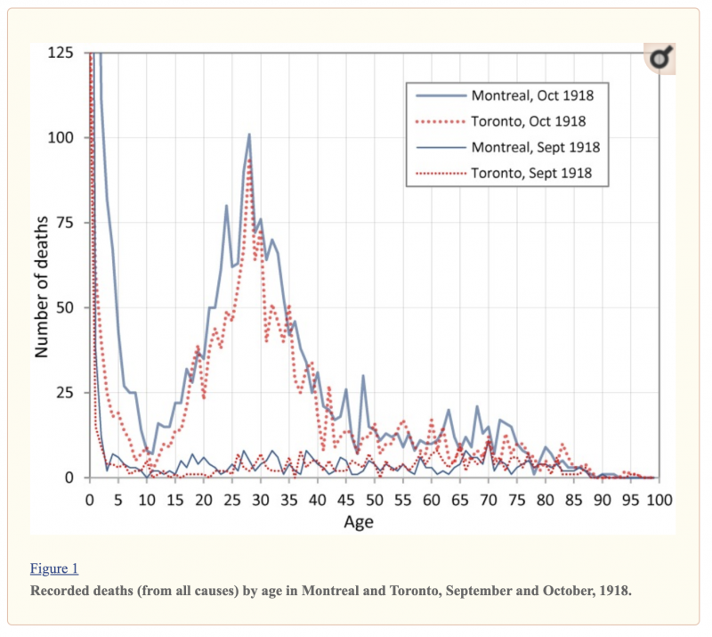
Scientists believe the nature of that strain caused “cytokine storms”, the phenomenon where the immune system overreacts and attacks itself. In a perverse twist of fate, this made the population with the strongest immune systems more vulnerable to the flu.
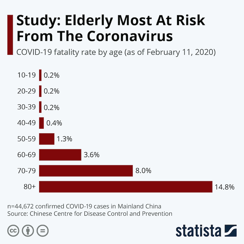
Contrast with COVID-19 where nobody disputes that the most vulnerable members of the population are the elderly and those with underlying medical conditions that render them immuno-compromised. In this sense, comparing 1918 to COVID-19 is not accurate or useful.
So, bear this in mind as I put in the graph below of how the Coronavirus Second Wave is playing out when it comes to case counts vs fatalities:
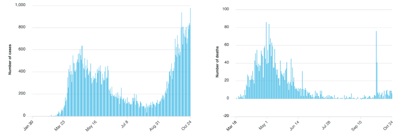
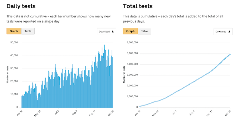
If we were in for a 1918-style Second Wave fatality overrun, we would see it in the data. As I pointed out in my previous post, the above data comes from the Province of Ontario, but pretty well all graphs from locales undergoing second waves in case counts, look the same. The fatalities are riding the floor (that “spike” in the fatality count was a data correction where they took previously missed data from the proceeding 90 days, and added them all to 2 data points), but the case counts are going up, as are the number of tests.
Right now the slope of the case count far exceeds the slope of the fatalities.
For the fatalities to come in anywhere near the Second Wave of 1918 scenario, the slope of the fatality line needs to blast off in a near vertical line right now. In the Ivor Cummins interview he mentioned Dr. Sunetra Gupta’s work indicating that COVID seems to peter out when it hits 20% of the population (but I can’t find the cite). If true, it is hard to envision a scenario where that is mathematically possible.
If not true, and we’re about to experience a Second Wave of fatalities, it would be impossible to occur without seeing it in the data and right now, all of the data, everywhere is showing either a moderate rise with seasonality, or an aggregate, overall decrease in fatalities.
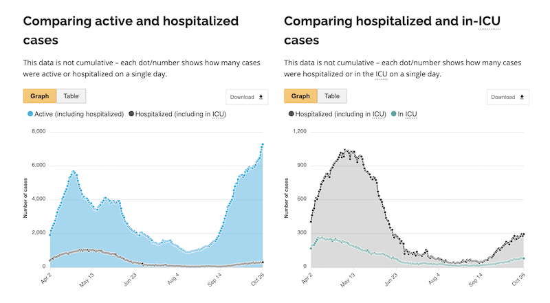
It’s also been pointed out that the rationale behind the lockdowns was to prevent the healthcare system from being overrun. Aside from a few notable exceptions in Phase 1, that didn’t happen. If we look at the data now, it doesn’t look like that’s going to happen now, either. When I first started posting about the second wave numbers, I pointed out that even the ICU cases line was diverging from the hospitalizations line (right side, below). Right now it looks like the total hospitalizations are lower in Wave 2, then they were in Wave 1, even against a case count exceeding previous highs.
All of this should be good news, but for some reason, people become very upset when you try to walk them through this. I’m open to all logic, data and science based objections or counter-points to where I am wrong on this, bearing in mind that “SHUT UP AND LISTEN TO THE GOVERNMENT AND SCIENCE” isn’t a logical, scientific or data driven counter-argument.
What to do next.
I would close out with two additional reading exercises, one, I would go look at The Great Barrington Declaration and if you think they’re approach of focused protection makes sense, sign it. Number two: have a look at the comparison of The Great Barrington Declaration with what’s called “The John Snow Memorandum“.
If you want to follow my work, and I seem to be covering more about the lockdowns lately, then sign up for the mailing list here, or follow me on Twitter here.
Footnote on Comorbidities
(*The number you see bandied around a lot is 94% of all COVID-19 fatalities had comorbidities. This number largely keys off CDC data that only 6% of fatalities list only COVID-19 as a c.o.d. If you look at the CDC data on what the comorbidities are, the biggest one accounting for close to half of all fatalities, especially in the elderly, is pneumonia and influenza. I think it’s inaccurate to just net-out all of those cases and dismiss them as comorbidities because that is one of the most common ways respiratory viruses manifest. But that said, the data, when you consider comorbidities and the looseness with which COVID gets added to c.o.d’s, what all this means is that the headline number for fatalities is the top boundary. They aren’t higher, and they are probably for all practical purposes, lower).


