
 electionfraud20.org
 This article is part of a series on Identifying Electoral Fraud Using Trend Analysis.
We recommend reading Part 4: When Winning Margins Go “Off the Charts” first, in order to understand the context.
Did you know that the numbers of voters registered for each party is a strong predictor of a final election result? In this article you’ll learn how to use these party registration numbers to predict the election results for a state or county. We’ll also compare this prediction with actual 2020 election results to assess the likely validity of those results, and derive a formula for an estimate of “excess” votes.
Seth Keshel used this method to correctly predict the outcome of all 50 states at the 2016 General Election, as well as his heat maps of suspicious counties in 2020. This section is heavily inspired from his work.
Let’s jump right in with a case study of Westmoreland County, Pennsylvania.
Introductory Walkthrough — Westmoreland County, PA
In order to perform this analysis we start by collating the total votes by party and total voter registrations by party for the last several years, for the particular county we’re interested in.
This data can usually be downloaded directly from your Secretary of State’s website, or from US Election Atlas which has a lot of free information online or detailed spreadsheets available for purchase.
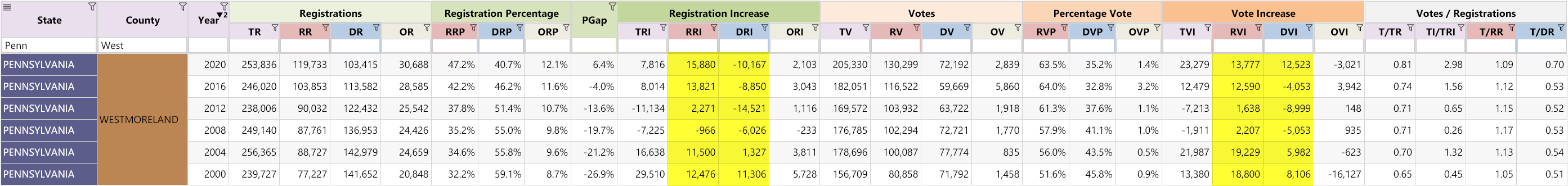
Here’s our data for Westmoreland County, from 2000–2020:
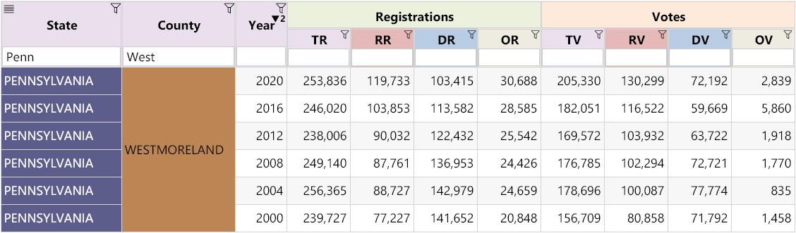
We’ve abbreviated the column names, but here’s what they mean:
| TV | Total Votes Counted in Election |
| TR | Total Registrations |
| RR | Republican Registrations |
| DR | Democrat Registrations |
| OR | Other Registrations |
| RV | Republican Votes |
| DV | Democrat Votes |
| OV | Other Votes |
From this information we can then calculate a few other numbers:
- The increase/decrease in votes and registrations between elections for each party
- The percentage share of votes and registrations each party has
- The “Votes / Registrations” ratio for each party (sometimes referred to as the “turnout”)
Here’s our updated spreadsheet:
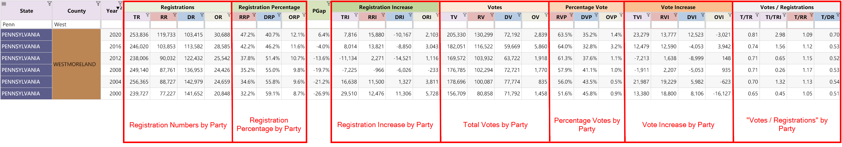
Here are the abbreviations for each additional column. Refer back to this table as you need to throughout the article.
| RRP | Republican Registrations as Percentage of Total |
| DRP | Democrat Registered as Percentage of Total |
| ORP | Unaffiliated (Other) Voters as Percentage of Total |
| PGap | Percentage Gap between Republican and Democrat Registration Percentages (RRP – DRP) |
| RRI | Republican Registration Increase (the change from previous election) |
| DRI | Democrat Registration Increase (the change from previous election) |
| ORI | Unaffiliated (Other) Registration Increase (the change from previous election) |
| RVP | Republican Votes as Percentage of Total |
| DVP | Democrat Votes as Percentage of Total |
| OVP | Unaffiliated (Other) Votes as Percentage of Total |
| TVI | Total Vote Increase (the change from previous election) |
| RVI | Republican Vote Increase (the change from previous election) |
| DVI | Democrat Vote Increase (the change from previous election) |
| OVI | Unaffiliated (Other) Vote Increase (the change from previous election) |
| T/TR | Total Turnout (Votes) Divided by Total Registrations (TV ÷ TR) |
| T/RR | Republican Turnout (Votes) Divided by Republican Registrations (RV ÷ RR) |
| T/DR | Democrat Turnout (Votes) Divided by Democrat Registrations (DV ÷ DR) |
Some of these columns are important to understand, so let’s explain them.
This column is very important and features pre-eminently in a lot of Seth Keshel’s videos.
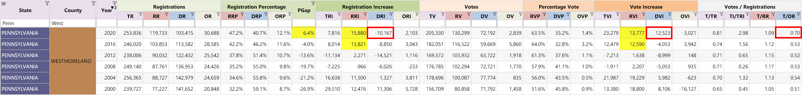
PGap is calculated by subtracting the Democrat Registration Percentage from the Republican Registration Percentage (RRP — DRP).
? For the states that keep registrations records, the registration numbers can be analyzed before an election takes place. This is exactly what Seth did in 2016 and 2020. He calculated the PGap trend to correctly predict the outcome of all 50 states at the 2016 General Election.
It is a powerful leading indicator.
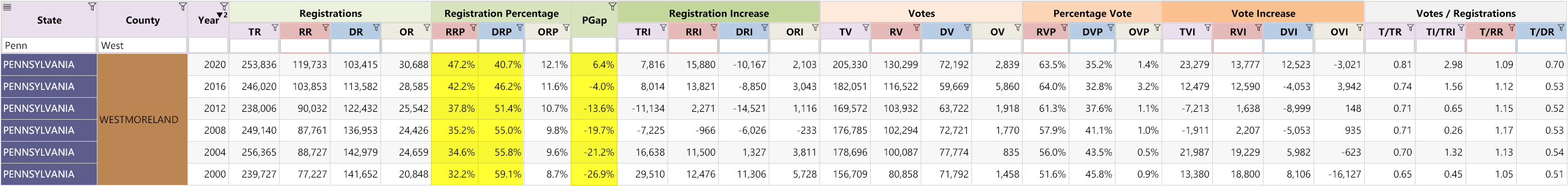
By looking at the PGap values over the different years, we begin to see a trend. From 2000 to 2020, we can see the Democrat Registration Percentage is decreasing and the Republican Registration Percentage is increasing each election, as it votes steadily more Republican each time.
The PGap went from a Democrat lead of 26.9% in 2000 to a Republican lead of 6.4% in 2020.
Registration Numbers
If we look at the raw registration numbers by party we can see that there has been an exodus from the Democrat party to the Republican party.
Keep these 2020 numbers in mind, which we’ll explain further below:
- 15,880 new people registered with the Republican party
- 10,167 people de-registered from the Democrat party
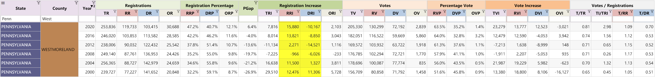
Now let’s look at both the Registration Increase as well as the Vote Increase for each party:
What do you notice when you look at the trend?
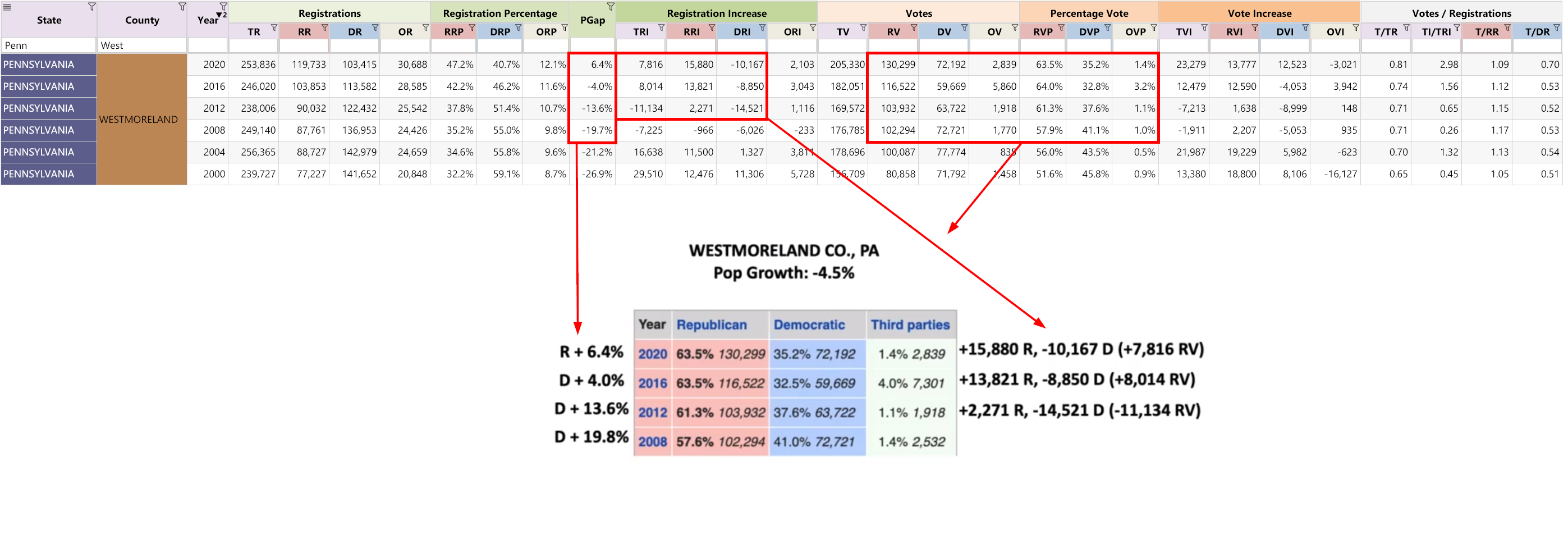
Here we begin to see some interesting things:
- The RRI and RVI move mostly in the same direction (either positive or negative) and have roughly similar values for every election since 2000, as one would expect.
- The DRI and DVI values move mostly in the same direction also for every election since 2000, except for 2020.
Here we find a strong exception to the prevailing trend: In 2020, the Democrats lost 10,167 registrants, but increased their vote count by 12,523.
Since the population in Westmoreland has been decreasing over the last 10 years, where did these extra votes come from?
“Votes / Registrations” Ratio
Finally, the T/RR and T/DR columns represent the “turnout” — which is votes divided by registrations — for the Republican and Democrat party, respectively.
What trend do you notice in the yellow highlighted numbers?
We see the T/RR value (Republican turnout) increased slightly up until 2008, after which it slowly but consistently decreased. The T/DR (Democrat turnout) remained fairly constant around 0.53 since 2000 … except in 2020 where it jumped to 0.70. That is a 32% increase from the previous election. That’s a very dramatic shift!
? TIP: From all our analysis across many counties and states we have found the “Votes / Registrations” ratio to be very stable and reliable. Big jumps in value are uncharacteristic and warrant a closer look.
These two turnout columns are extremely useful for:
- Highlighting potential fraudulent activity
- Estimating excess or shortfall votes for either party
Now that you have a grasp of what the columns mean, let’s dig a bit deeper and see what else we can find. We’ll highlight any cells that stand out or diverge starkly from the trend.
Observations
- As we noted earlier, the Democrat Vote Increase (DVI) strongly contradicts the downward change in registrations (DRI). Democrats have been consistently losing votes in the thousands since 2008, but in 2020, with 10,167 less registrants, they managed to increase their vote count by 12,523. ⚠️ This completely violates the PGap and DRI trends.
- The RRI and RVI values align with the trend as we would expect
The increase of 12,523 Democrat votes is very suspicious and explains why the T/DR ratio is so high.
If the T/DR ratio remained on the same trend, it would remain around 0.53. We can use this to calculate an estimate of the excess votes.
We could now say that in Westmoreland County, the Democrats appear to have 17,382 more votes than the trend would indicate.
Note that we have not accounted for a potential shortfall of Trump votes, but you could calculate that also if desired.
Now that we’ve explained the process of performing a “Registration Trend” analysis, watch the corresponding video from Seth Keshel that brings it all together:
Here is an image that shows how the table of data we have been using matches with the table Seth uses in his presentations:
Seth Keshel’s Videos
You can watch all of Seth’s county analysis videos on his archive Telegram channel or on our website.
Here are a handful to get you started (each is around 7 mins):
Seth’s videos are compelling, and provide a strong case for trend analysis.
We strongly encourage readers who are interested in this type of analysis, to carefully read his findings on Pennsylvania.
Even though Seth places a lot of emphasis on the PGap trend, we have found that it is not always reliable for all states. Some states do a good job of keeping their voter rolls up to date. Others don’t.
When states keep their voter roll records up to date, the PGap trend is powerful. However for states that don’t, we have found the T/RR and T/DR trends to be more reliable.
For states that do not keep any party registration information, we can fall back on the RVI and DVI trends instead.
Summary
Historical registration information can be used very effectively to identify counties that are “bucking” their own historical trends.
We explained the formula that can give us an estimate of excess (and shortfall) votes, based on the “Votes / Registrations” ratio (i.e. the T/DR and T/RR ratios).
From our own in-depth analysis that has been going on for many months now, we’ve observed this ratio to be remarkably stable over the years, except in 2020 where the ratio increased significantly for the Democrat party, in many counties, in nearly every state.
With so many counties bucking trends and setting new turnout records, combined with the reports of poor security and election mishandling, the results do look suspect. We believe contacting voters directly (canvassing) combined with forensic audits (where necessary) is crucial to conclusively determining the validity of the election.
Our next article continues with these same methods to examine case studies from Maryland and Florida.
Other Articles In This Series
| Part 5 | Learn how to use the party registration numbers for each county to predict the election results for a state and assess the likely validity of the results. This is a guide on the method Seth Keshel uses for his predictions and county heat maps, allowing you to dig into the trends of your own county and uncover anomalies. |


